
Problem Statement
“We often see users struggling to navigate the cluttered and complex interface of the SBI Card mobile app, leading to frustration, higher drop-off rates, and reduced engagement. Can we redesign this experience to be more efficient, intuitive, and user-friendly, ensuring a smoother journey from start to finish?”
?
DESIGN APPROACH


Task Analysis & Journey Maps
The personas and empathy maps helped us outline an hierarchical task analysis, which we then used to make a journey map highlighting the pain points and the opportunities for improvement.
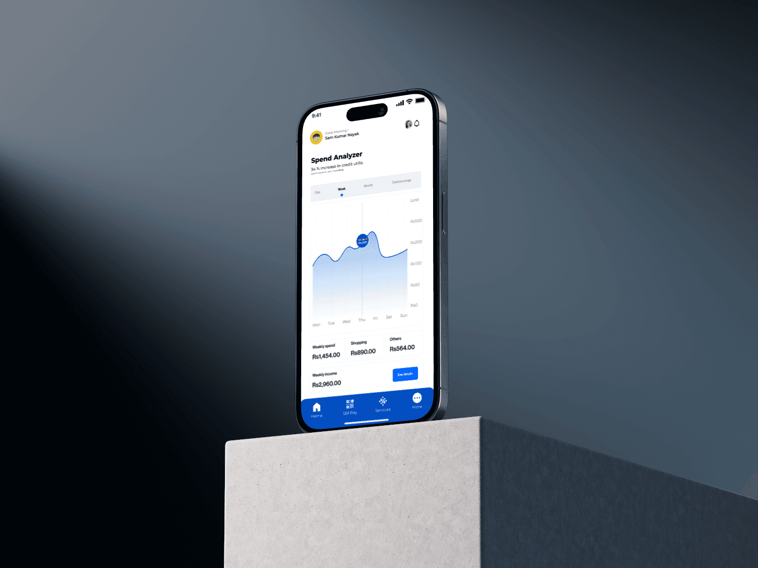
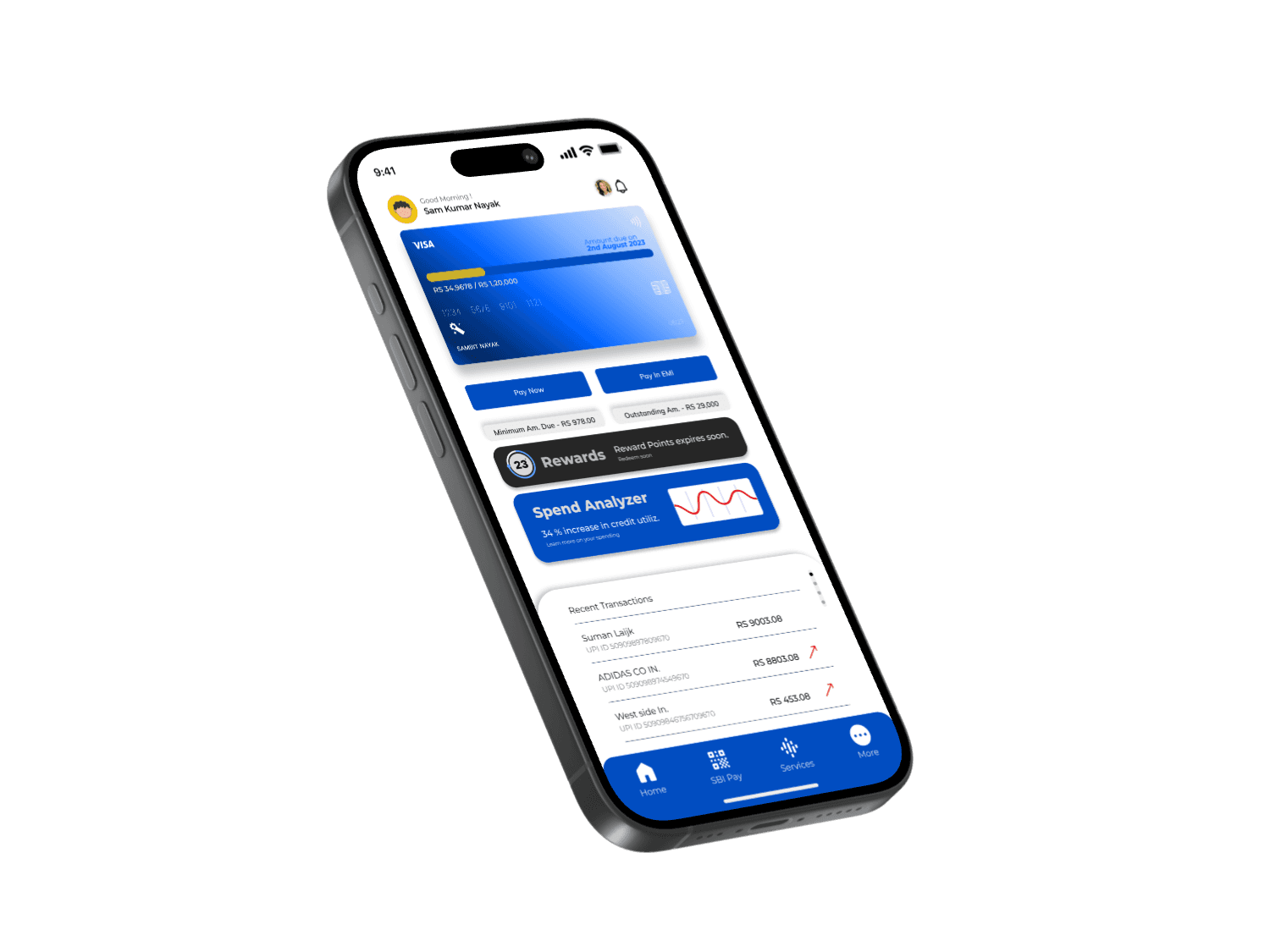
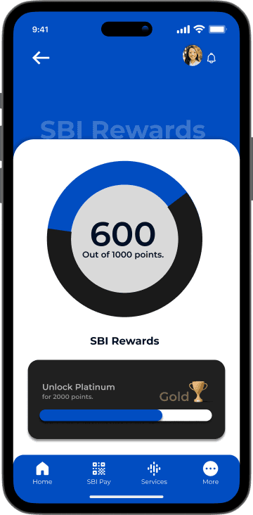
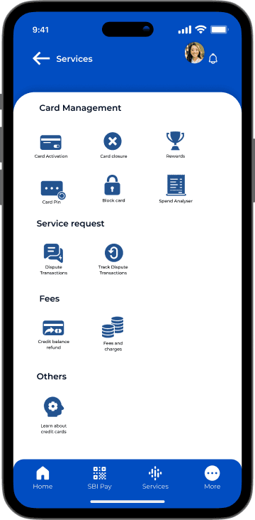
2. Home Screen
• Options available:
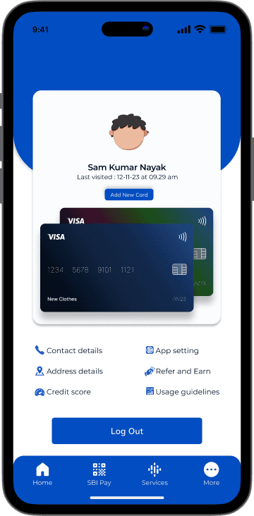
• Profile:
• Edit profile
• Log out
• Notifications
• Ask Ila (Chat assistant)
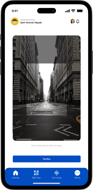
• SBI Pay
• Services
• Pay details
• Bill received
• Card Management:
• Edit profile
• Log out
• Service Request:
• Edit profile
• Log out
• Fees:
• Edit profile
• Log out
• Others:
• Edit profile
• Log out
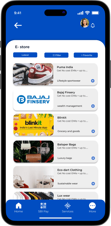
• More:
• E-store
• Insurance
• Benefits
3. Exit App
• Users have the option to log out from several screens:
• Profile
• Services
• Card Management
• Others
USER ANALYSIS


UNDERSTANDING EXISTING INFORMATION ARCHITECTHURE
“We often see users struggling to navigate the cluttered and complex interface of the SBI Card mobile app, leading to frustration, higher drop-off rates, and reduced engagement. Can we redesign this experience to be more efficient, intuitive, and user-friendly, ensuring a smoother journey from start to finish?”


HEURISTICS EVALUATION


TESTIMONIALS


LEARNINGS

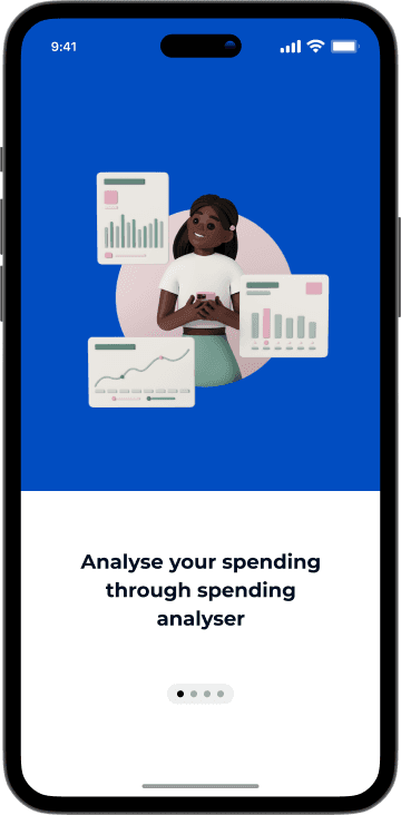
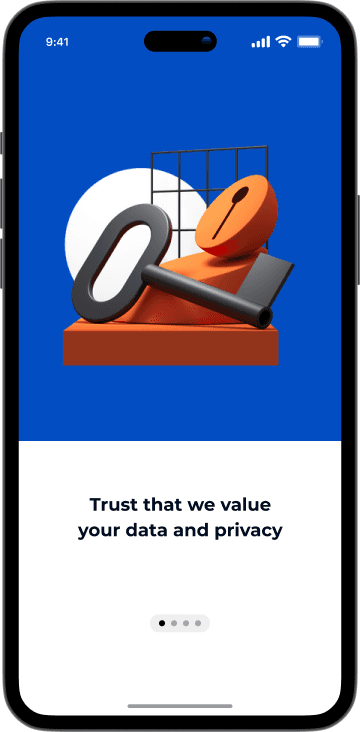
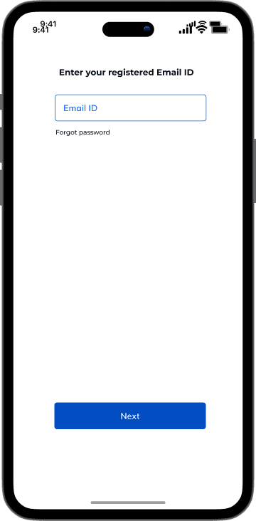
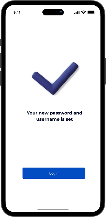
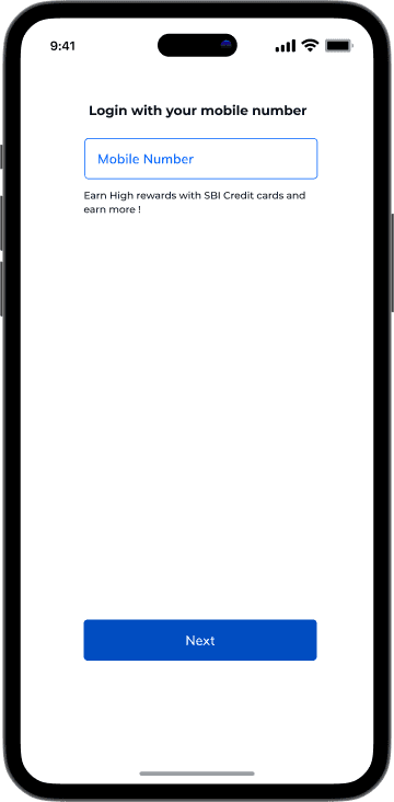
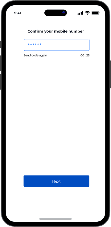
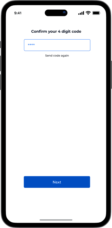
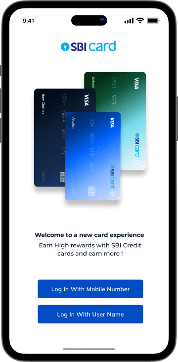
The reworked Onboarding is far simpler since I eliminated unnecessary design features and functions in the sign-in procedure.


Revamped all services with a distinct logo and structured division of work.
E-Store
Benifits


SBI pay


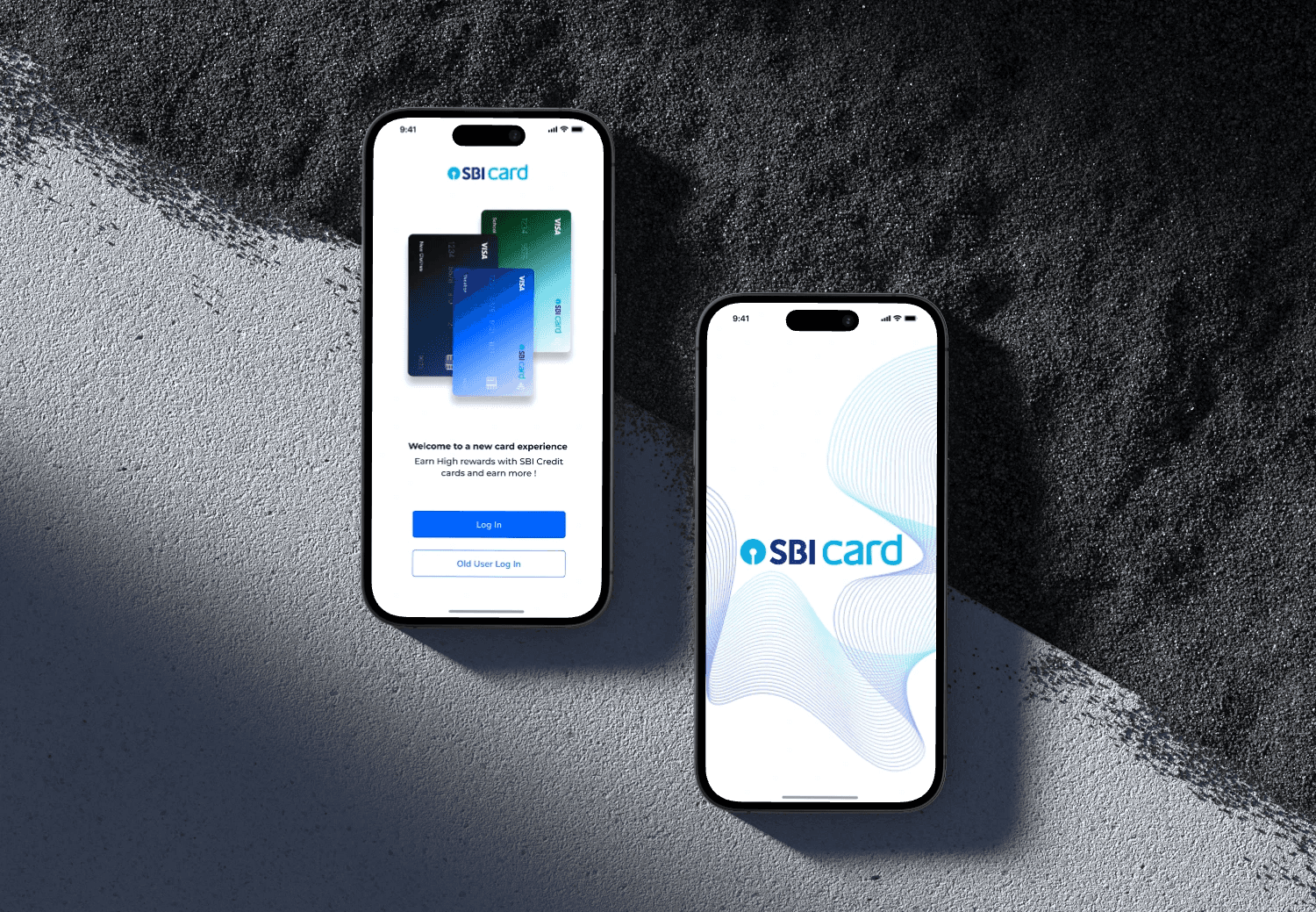
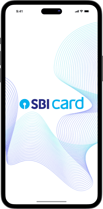
Onboarding