3 months: jan- march 2023
Re-design and branding of Luxury
clothing brand- Jurani
My Role
UX Design, design system +
components, UX flows,
UX Research
Team
2 UX Designer
1 Front end dev
Timeline
3 months
Company
Jurani (Luxury menswear
retailer/manufacturer)
Type
Freelancing
Project details
Project Overview
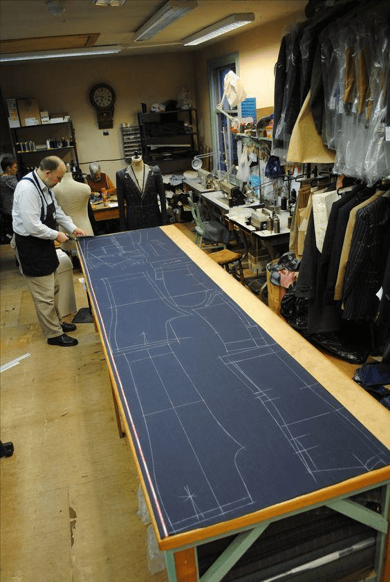
As part of a freelance project, our two-person team was tasked with redesigning and rebranding a international luxury menswear bespoke retailer based in East India. The client provided references and requested a website that not only reflected their high-end brand but also attracted significant traffic.
We approached the project with an evidence-based design solution, carefully analyzing the brand’s market position and user needs. Every detail, from the visual elements to user experience, was strategically crafted to reflect the retailer’s sophistication and drive engagement, ultimately helping the client regain their brand’s presence and appeal in the digital space.
Jurani
Shipped Product
JURANI
Browse through the site beneath and experience the genuine feel of custom-made bespoke clothing
Expand for best experience
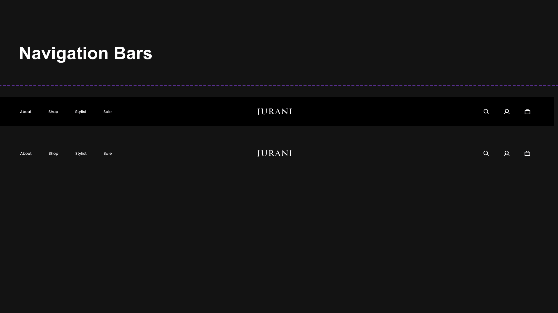
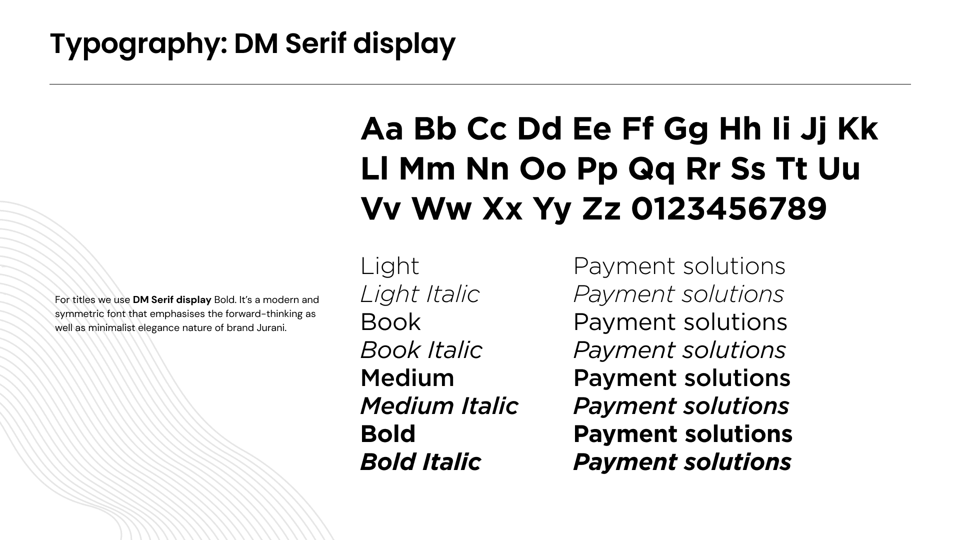
Design System


Data from google anaytics
Impact and outcomes
Good website reviews
After 1 year customers base increased to 8,000 who booked an appointment
200 % increase in website traffic
44 user interviews
Completed the projected with 3 months
35% conversion
Context and the Why ?
Problem Space
Jurani was not getting enough traffic and its website and branding was not updated since a long time.
This resulted in loss of existing clients and overall customers drop.
" Since a year I have seen the customer base is going really down. Our website is not updated and also the branding looks a little old. I also want to onboard new clients on this process."- Owner
72% drop in customer base since covid.
Branding and digital identity doesn't reflect the true craftsmanship of the brand.
How the project got implemented
My Design Process
The whole design process was divided into 2-1 type weeks and the reason behind that was iterations do take time
and a week in between the process helps us to double verify with clients.

Evaluating existing website through Heuristics
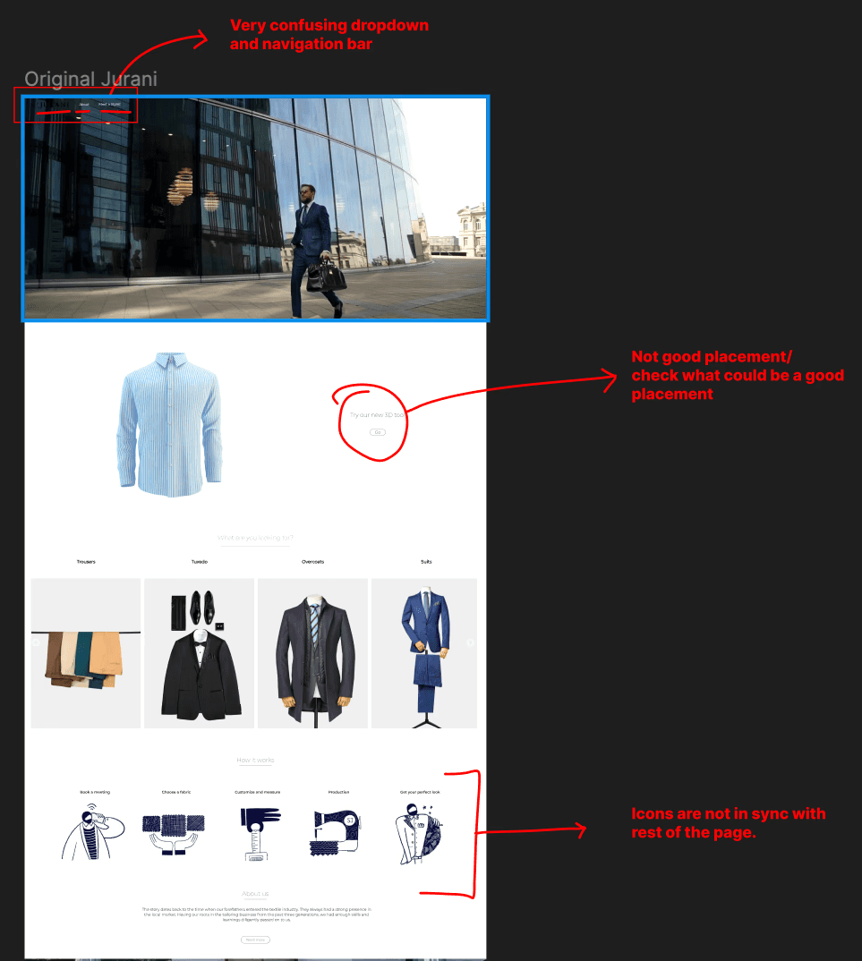
Visibility of System Status
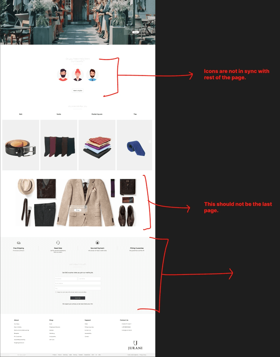
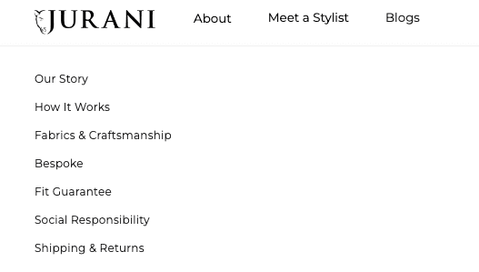
What I noticed: The dropdown menu and navigation bar are really confusing. I found myself unsure of what I had selected or where I was on the site. It doesn’t give immediate feedback about my current position.
What would help: Adding clear indicators when I select something would make it easier for me to know where I am and what I’m interacting with. A simple highlight or active state would be a game-changer.
Consistency and Standards
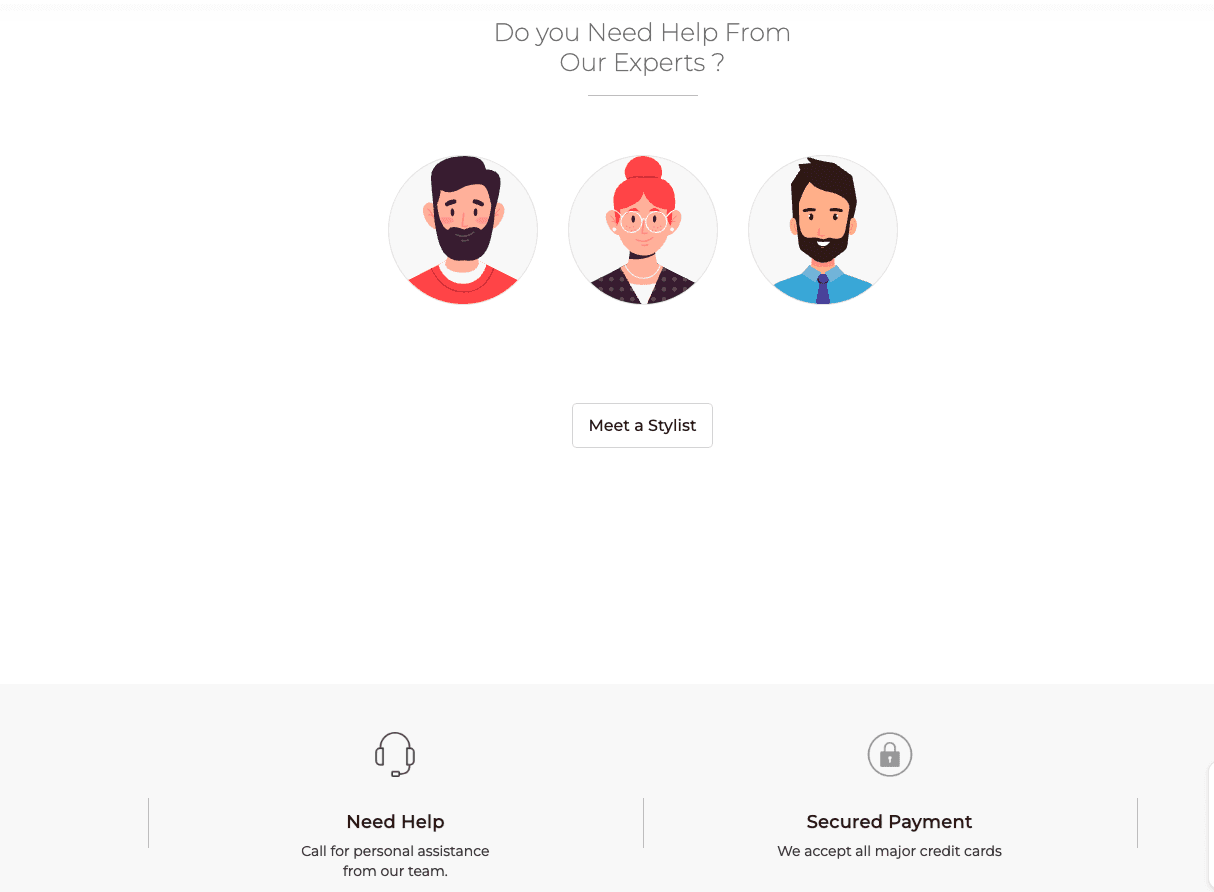
What I noticed: The design feels a bit inconsistent. Some icons and elements just don’t match up with the rest of the page’s style, which creates confusion.
What would help: If the design and placement of elements followed a more consistent standard throughout the page, it would feel much more cohesive. This would reduce the need for me to stop and think about what different elements do.
Interview Survey
We conducted a remote usability study with 44 brand customers to evaluate the prototype. Participants completed specific tasks,
followed by a qualitative survey that encouraged them to explain their thought process during the tasks.
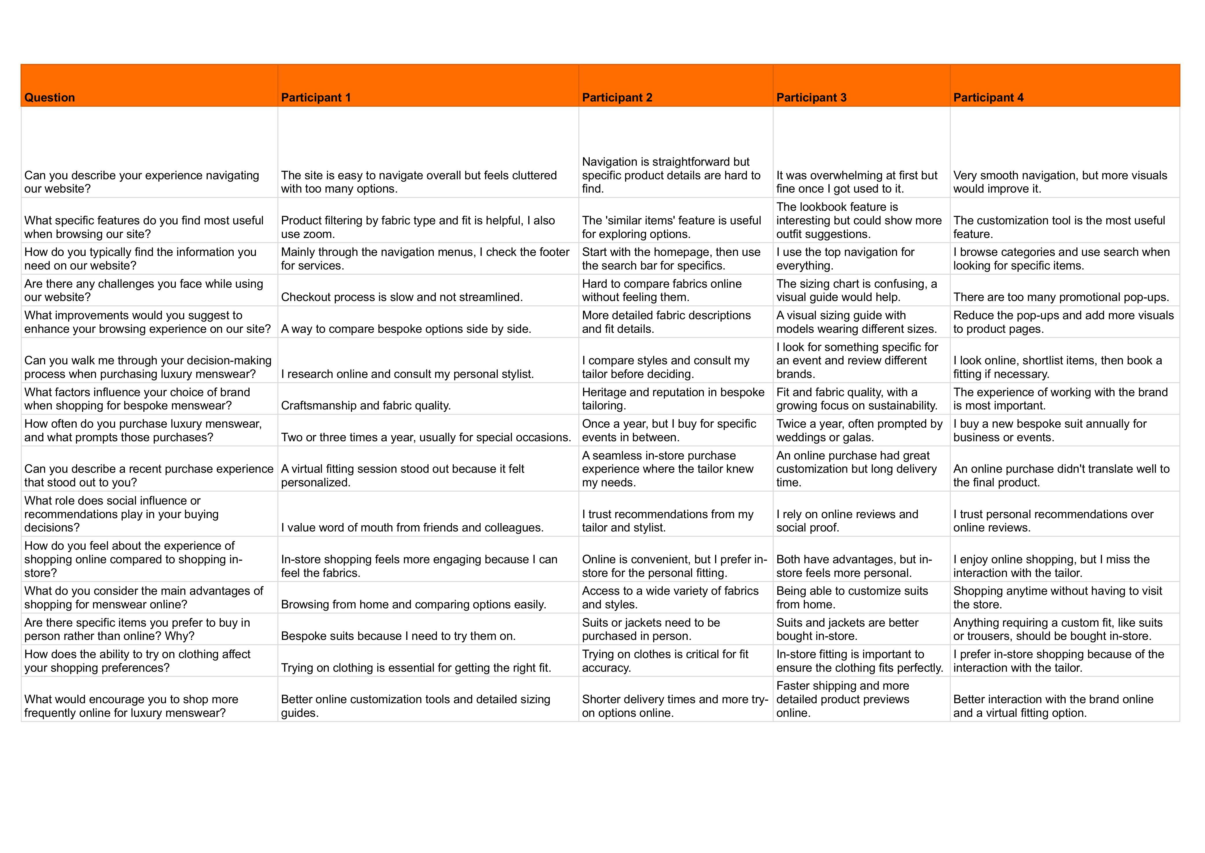
We conducted user evaluation and review sessions to evaluate the pre existing website and a understanding user journey.
A set of standard questions were asked to evaluate the pain points while using the website. Here is a glimpse of the interviews
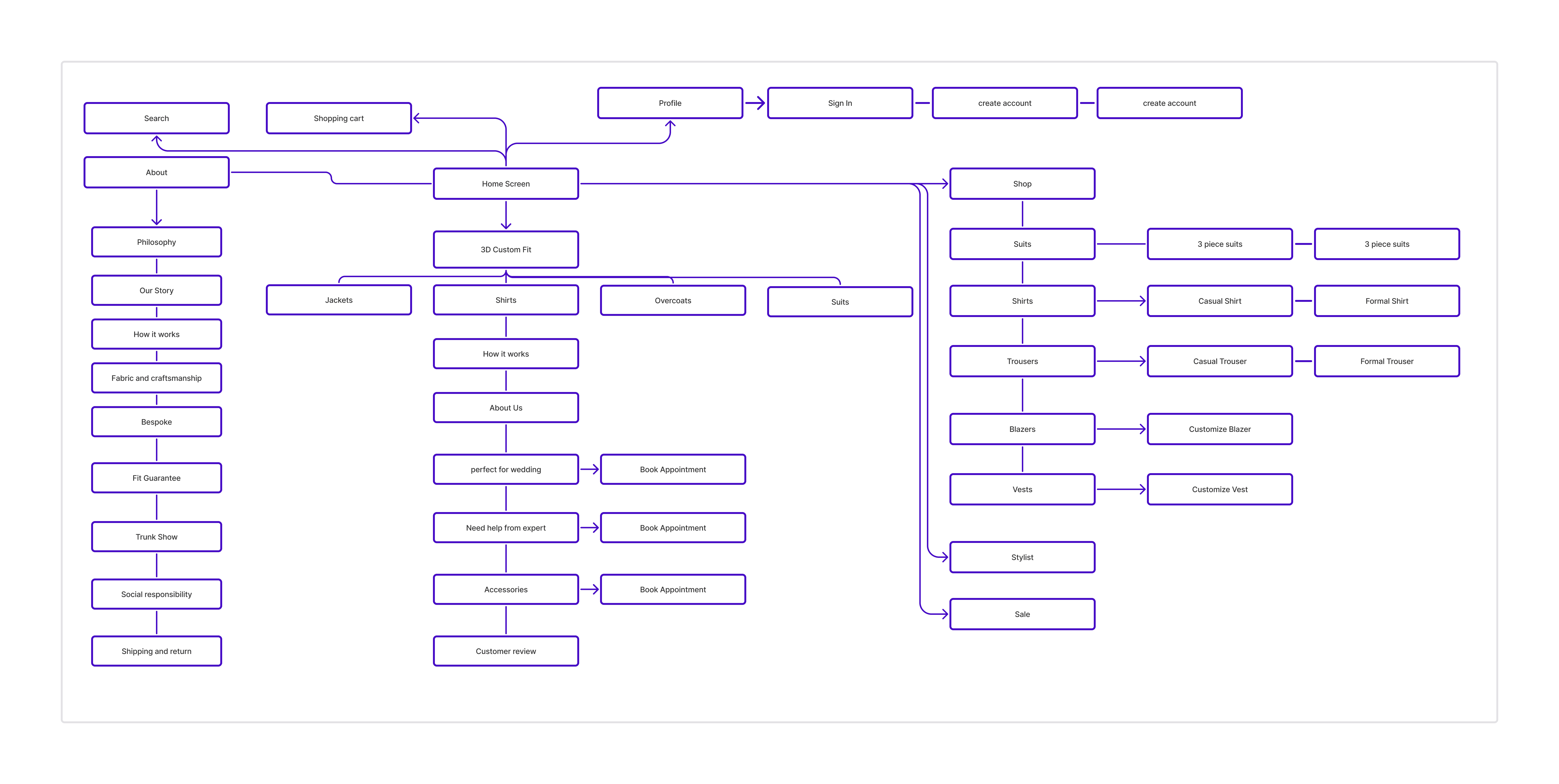
Finalized Information Architecture
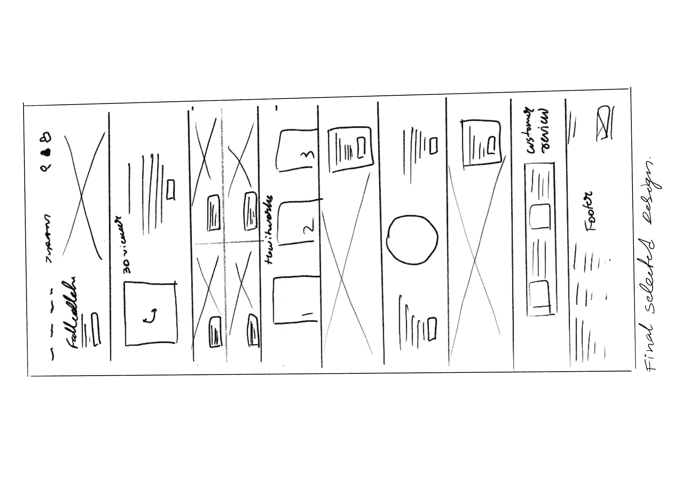
Low fidelity
We went through an extensive exploration phase, evaluating approximately 16 design variations for the app.
Each design was assessed based on its alignment with our target audience.
Out of these 16 concepts, only 6 designs were ultimately selected.

High Fidelity
We conducted a remote usability study with 44 brand customers to evaluate the prototype. Participants completed specific tasks,
followed by a qualitative survey that encouraged them to explain their thought process during the tasks.
We conducted user evaluation and review sessions to evaluate the pre existing website and a understanding user journey.
A set of standard questions were asked to evaluate the pain points while using the website. Here is a glimpse of the interviews
What were the roadblocks ?
Confusing Dark-Mode
85% of testers found the dark mode on the website confusing and difficult to navigate. The contrast between text and background, as well as unclear visuals, contributed to the overall frustration.
Need for clear visuals
The target audience, men aged 32-55, expressed a strong preference for clearer visuals and well-defined headings. They emphasized the need for a layout that is easy to read and navigate, particularly in darker themes.
Users reactions
"It'fine but everything seems so dark, love the aesthetics but some more clearer images would be beneficial."- James, 32
"it’s difficult to navigate the site because the visuals are unclear. The text blends into the background too much, making it frustrating to use.”
- Ankit, 42
“The dark mode is visually straining, especially when trying to read smaller text. The lack of contrast between the background and the font makes it hard to find what I’m looking for.”
- Peter, 39
Iteration, rejected due to low retention during A/B Testing
Reflections
My Learning
Being a UX Designer for this project, I was fortunate to design and prototype for this unique brand
with unique customer base. In a fast paced scenario, meeting the client's expectation was tough but managed
to exceed that with a real prototype that was approved by a lot of users.

